Part of the ShopifyLift Series
Start here: The Shopify Growth Guide 2026: Key Strategies and Trends Every Merchant Should Know
Related deep dives:
Shopify Product Page Optimization: Maximize Conversion, AI Visibility, and Search Rankings
A great product page does three things simultaneously:
- Converts browsers into buyers (human conversion)
- Appears in AI search results (ChatGPT, Claude, Perplexity recommendations)
- Ranks in Google for product-intent keywords (organic traffic)
Most Shopify merchants optimize for one usually conversion and ignore the other two. That's leaving 30-50% of potential revenue on the table.
Here's the new reality in 2026:
Google's AI Overviews now cite product pages directly in search results. ChatGPT and Claude can recommend products from your catalog when they're properly structured. Perplexity surfaces product pages in comparison queries. Merchants who optimize for all three simultaneously are seeing 15-25% conversion lift + 20-40% organic traffic increase + 2-3x AI visibility.
The mechanics are simpler than you think. It's not about cramming keywords. It's about:
- Clear, scannable product information architecture
- High-quality images and videos that demonstrate value
- Trust signals (reviews, guarantees, certifications)
- Schema markup that tells both Google and AI assistants what you're selling
- Conversion-focused CTAs and checkout flow
- Mobile-first design that works on all devices
This guide walks through every element of a product page that impacts conversion, SEO, and AI visibility. We'll cover what to optimize, how to structure information, which technical elements matter, and a 30-day implementation roadmap to fix your existing product pages.
Why Product Page Optimization Matters (The Economics)
Product pages are the highest-intent traffic on your store. Someone is already interested in the category, has read reviews, compared options and landed on your product.
The conversion funnel:
| Stage | Avg. Percentage | Action | Page Element |
|---|---|---|---|
| Click to product page | 100% | Visitor lands on PDP | Page load, first impression |
| View product details | 85% | Reads title, price, images | Title, primary image, price visibility |
| View reviews/ratings | 72% | Checks social proof | Review section, star rating |
| Scroll to bottom | 55% | Engages with full content | Description, specifications, FAQ |
| Add to cart | 18% (avg) | Begins checkout | CTA placement, trust signals |
| Complete checkout | 65% (of cart) | Converts | Checkout UX |
| Final conversion | 12% (of visitors) | Customer acquired | Full funnel |
Optimization impact:
- Moving "add to cart" from 18% → 22% (conversion lift through better copy + CTA) = +22% revenue
- Moving "view reviews" from 72% → 85% (placing reviews higher on page) = +18% average order value (social proof)
- Moving "scroll to bottom" from 55% → 70% (better information architecture) = +25% product understanding (fewer returns)
For a 1,000-visitor/day store:
- Baseline conversions: 1,000 × 12% = 120 sales/day
- With optimization: 1,000 × 14.5% (18% → 22% add-to-cart, 72% → 85% reviews, 55% → 70% scroll) = 145 sales/day
- +25 sales/day = +$2,500-5,000/day revenue (assuming $100–200 AOV)
- +$75-150K annual revenue with zero additional traffic
This is pure conversion optimization before we even talk about SEO or AI visibility.
The Product Page Anatomy: 8 Critical Elements
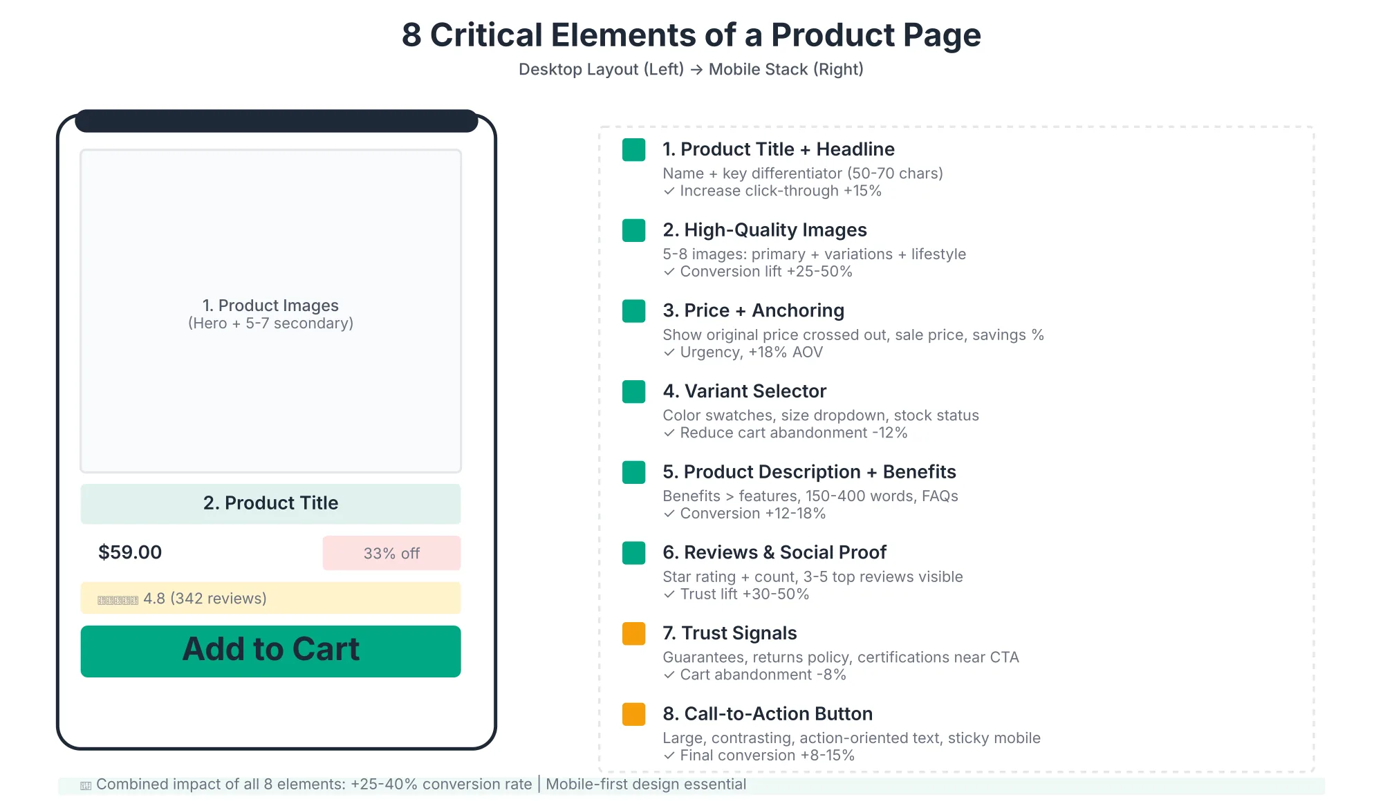
Every successful product page includes 8 core elements each with a specific job to do. Get all eight right, and your conversion rate compounds.
1. Product Title & Headline
What it does: First 3-5 words determine whether visitor stays or bounces. It's simultaneously a conversion lever, an SEO element, and an AI comprehension signal.
Best practice:
- Product name + key differentiator (in natural language)
- Include primary benefit or use case if it's not obvious from the name
- 50-70 characters (fits on mobile without truncation)
- Avoid vague generic names; specificity wins on all channels
Examples:
❌ "Blue Merino Wool Hoodie"
✅ "Merino Wool Zip Hoodie Breathable, Wrinkle-Resistant (Perfect for Travel)."
❌ "Running Shoes"
✅ "Ultra-Light Carbon Trail Running Shoes | 4.2oz, Responsive Cushioning"
Why it matters:
- Human conversion: Specific, benefit-focused titles trigger "this solves my problem" instantly
- Google rankings: Titles with keywords and modifiers rank for longer-tail, high-intent queries
- AI visibility: ChatGPT, Claude, and Perplexity parse titles to understand category and differentiation. Vague titles result in vague recommendations.
Pro tip: Test title variations against bounce rate and conversion. A/B testing product titles for 2 weeks typically reveals a 10-15% variance in performance.
2. Product Images & Video
What it does: 80% of purchase decisions are influenced by image quality. Video increases conversion 30-50%. High-quality, diverse imagery is also essential for Google Shopping visibility, Google AI Overviews, and AI assistant recommendations.
Best practices for primary image (hero shot):
- Resolution: 2000×2000px minimum (3000×3000 ideal for high-DPI displays)
- Background: White or very light neutral (Google Shopping requirement; also how AI assistants display products)
- Framing: Product takes up 60-75% of frame (not too isolated, not too tight)
- Lighting: Natural, even lighting (shows true color; avoid harsh shadows)
- No clutter: No watermarks, text, or logos (product must be the focus)
- Format: Square aspect ratio (1:1) for consistency across devices
Secondary images (5-8 minimum):
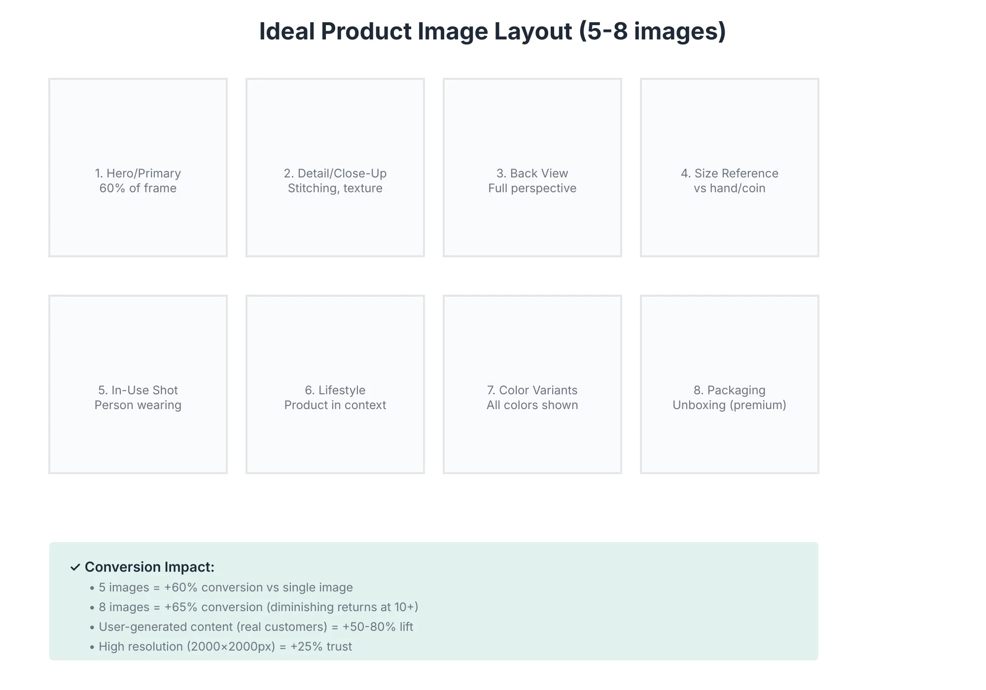
- Front/Detail view - Close-up that highlights texture, quality, materials
- Back/Side view - Shows full 360° perspective (particularly important for apparel, bags)
- Size comparison - Product against hand, coin, or standard reference object
- In-use/Lifestyle - Product being used in context (not just a product shot)
- Detail shot - Close-up of seams, stitching, branding (builds confidence)
- Packaging/Unboxing - What customer receives (especially important for gift purchases, subscriptions)
- Color variants - If available (side-by-side comparison of all color options)
Video guidance:
- 30-60 seconds maximum (attention span on mobile)
- Demonstrate value: how to use, what it solves, quality proof
- Must autoplay with sound off (then enable sound on interaction)
- Host natively (Shopify native video) or on Vimeo (avoid auto-play ads)
- Include captions (60% of video viewed without sound)
Why images matter for all three channels:
- Human conversion: The first 5 images determine a 50%+ lift in conversion
- Google Shopping: White-background images rank higher in shopping results; style matters
- AI visibility: ChatGPT and Claude can "see" product images and recommend based on visual quality; blurry or low-quality images tank recommendations
- In-use shot (person wearing/using product)
- Detail close-up (if relevant-stitching, material, etc.)
- Lifestyle shot (product in context)
- Packaging/unboxing (if premium product)
- Care/sizing chart (visual reference)
Video (optional, but high-ROI):
- 20-60 seconds
- Show product in use
- Include size reference
- Address common questions
- End with clear CTA
- Host on YouTube or Vimeo (embed, not auto-play)
Mobile considerations:
- Stack images vertically (easy swipe)
- Ensure touch targets are 44px+ (easy to tap)
- Test zoom functionality (allows close inspection)
3. Price & Pricing Psychology
What it does: Price visibility + anchoring drives add-to-cart rate.
Best practices:
Price Placement:
- Primary product image row (immediately visible)
- Include currency symbol
- If on sale: Show original price (struck through) + sale price + discount % saved
- Example:
$89$59 (33% off)
Pricing Psychology:
- Show bundle discounts early (buy 3, save 20%)
- Offer payment plans (Shopify Pay Later, Affirm) for orders >$100
- Use "from $XX" for variants (ranges confuse buyers)
- Avoid "$99.99" anchoring if product is premium (use "$100" instead reads cleaner)
Trust signals around price:
- "Free shipping on orders over $X"
- "Lowest price guaranteed" (if true)
- "In stock, ships today" (reduces purchase anxiety)
4. Variant Selector (Size, Color, Style)
What it does: Clear variant selection prevents cart abandonment at checkout.
Best practices:
Color/Pattern Variants:
- Use swatches (clickable color blocks) instead of dropdown
- Show thumbnail of product in that color/pattern
- Update hero image when variant selected
- Label with color name + "In stock / Out of stock / 2 left"
Size Variants:
- Show size chart visually (don't hide behind link)
- Include measurement details (inseam, chest, length)
- Option to "find your size" with fit quiz (reduces returns)
- Link to "size conversion guide" if international variants
Stock Indicators:
- "In stock" (green, prominent)
- "Only 2 left" (urgency, if true)
- "Out of stock" (gray, with email notification option)
- Don't show exact stock count >5 (creates false scarcity)
5. Product Description & Benefits
What it does: Converts "interested" into "convinced."
Structure (in order):
1. Benefit statement (one sentence)
"This hoodie keeps you warm in winter without bulk ravel-friendly and wrinkle-resistant."
2. Key features (3-5 bullets, benefit-forward)
- Merino Wool (100%): Naturally temperature-regulating (warm in winter, cool in summer)
- Wrinkle-Resistant: Travel-ready no ironing needed
- Lightweight (8oz): Packs into backpack, works alone or as base layer
- Hand-Washable: Easy care, lasts 100+ wears with Merino
- Available in 6 colors: Neutral tones designed to mix-and-match
3. Why it works (the story)
A 2-3 sentence paragraph explaining materials, manufacturing, and design philosophy.
4. Full product description (4-6 paragraphs)
Detailed breakdown: construction, fit, care instructions, warranty/guarantees.
5. Comparison table (if relevant)
vs. cotton (heavier, wrinkles), vs. synthetic (doesn't breathe), vs. merino from competitors (show your advantages)
Length: 150-400 words is ideal. Longer if comparison is complex.
Writing tone:
- Conversational, not marketing-speak
- Address common objections (shrinkage? itching? price? durability?)
- Use second person ("you") not first ("we")
6. Reviews & Social Proof
What it does: Reviews increase conversion 30-50%. Visible reviews increase trust at top of page.
Best practices:
Review section placement:
- Above the fold OR immediately after primary image
- Minimum 4.0 stars (if below, hold off publishing until you get higher-rated reviews)
- Display star rating + review count prominently
- Example: ⭐⭐⭐⭐⭐ (4.8 stars, 342 reviews)
Review filtering:
- Sort by "most helpful" (not just newest)
- Filter by rating (let customers see 5-star, 4-star separately)
- Filter by "verified purchase" (separates real customers from spam)
Review display:
- Show 3-5 top reviews on PDP
- Include reviewer name, verified purchase badge, date
- Highlight reviews with images/video (user-generated content converts)
- Show both 5-star and 4-star (3-4 stars with constructive feedback are more credible than all 5-stars)
Managing reviews:
- Ask for reviews post-purchase (email automation)
- Offer incentive (discount on next order) if legal in your region
- Respond to negative reviews publicly (shows you care)
- Pin top review with images to top
User-generated content (UGC):
- Add widget for customer photos/videos
- Feature UGC on product page (overrides studio photos for authenticity)
- UGC increases conversion by 50-80%
7. Trust Signals & Guarantees
What it does: Removes purchase risk. Addresses "what if I hate it?" anxiety.
Elements to display prominently (near CTA):
- Return policy: "30-day returns, no questions asked"
- Warranty/guarantee: "2-year durability guarantee"
- Certifications: If relevant "Fair Trade," "Organic," "GOTS," "Ethical Manufacturing"
- Money-back guarantee: "Not happy? Full refund within 90 days"
- Security badges: SSL certificate (padlock icon), Shopify Trust Badge
- Shipping info: "Free shipping on orders over $50," "Ships in 24 hours," "Arrives in 3-5 business days"
Visual design:
- Icons help (return icon, shield icon, clock icon)
- Place near CTA (above "Add to Cart" button)
- Use short, scannable copy (not paragraphs)
8. Call-to-Action (CTA)
What it does: Final conversion trigger.
Best practices:
Button design:
- Contrasting color (stands out from page background)
- Large target (44px height minimum for mobile)
- Single, primary CTA above the fold
- Secondary CTAs below (email for updates, add to wishlist)
CTA Copy:
- Action-oriented: "Add to Cart," "Buy Now," "Get Yours"
- Avoid generic "Submit" or "Continue"
- Include urgency if true: "Add to Cart (2 Left)"
- For high-price items: "Add to Cart & Checkout" (clarifies next step)
CTA placement:
- Immediately below primary image + price (above fold)
- After benefits section (mid-page, for browsers who scroll)
- Sticky/floating CTA for mobile (stays visible while scrolling)
Post-CTA actions:
- Show "added to cart" confirmation (visual feedback)
- Offer related product recommendations (upsell opportunity)
- Option to continue shopping or checkout
Conversion Funnel: Where Visitors Drop Off
Most stores don't understand why their conversion rate plateaus. The issue is always funnel leakage at one or two specific steps.
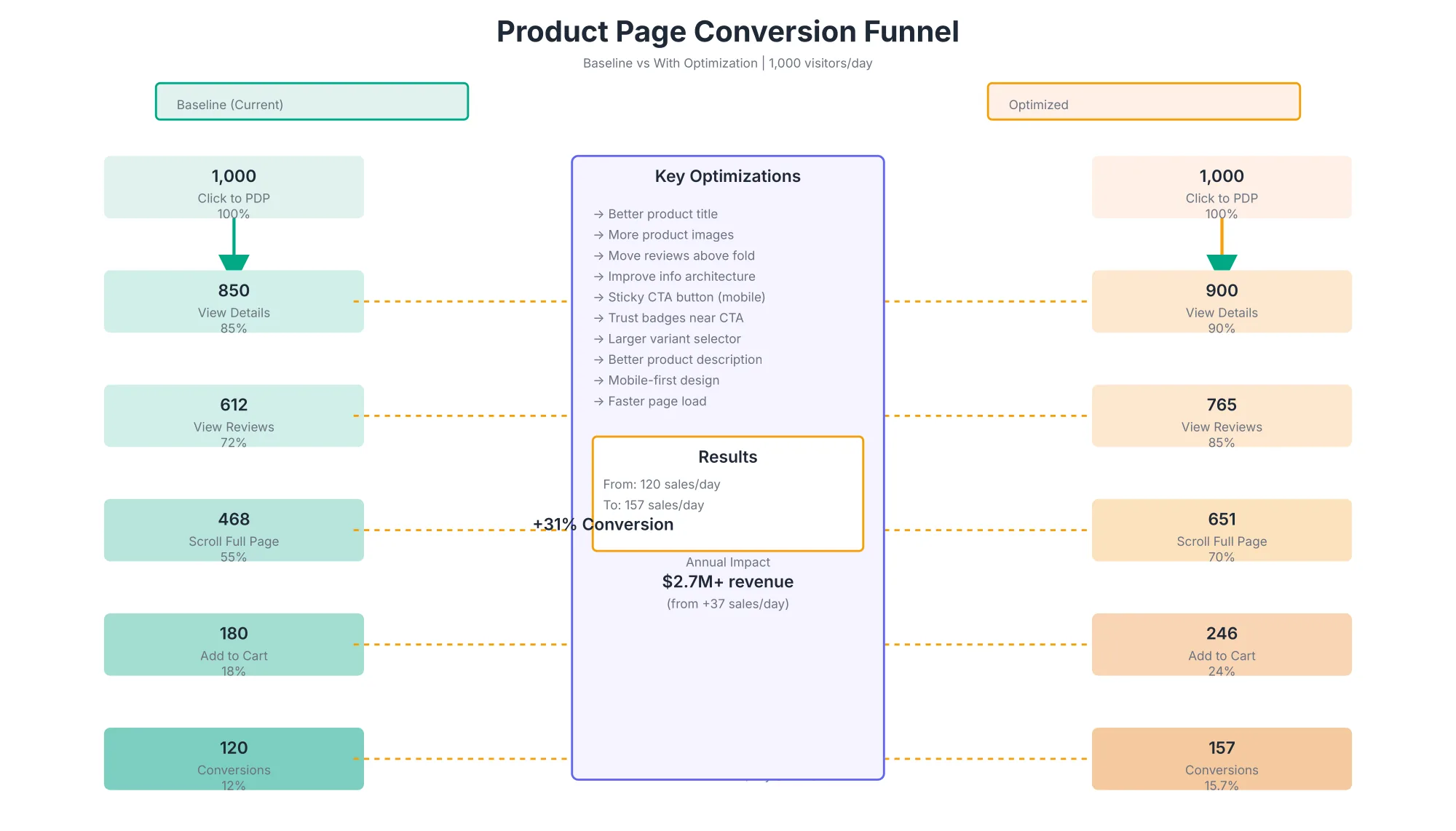
Here's what high-performing stores fix:
- "View reviews" stage: Move review section above the fold (vs. middle of page) → 72% → 85% view rate
- "Scroll to bottom" stage: Better content architecture (specs, FAQs, shipping info grouped logically) → 55% → 70% scroll rate
- "Add to cart" stage: Clearer CTAs, reduced form friction, multiple CTA placements → 18% → 23% add-to-cart rate
Each 1% improvement at the "add to cart" stage is worth $100-500/month in additional revenue for most stores.
Schema Markup: Telling AI What You're Selling
Schema markup is the structured data that tells Google, ChatGPT, Claude, Perplexity, and other AI systems exactly what you're selling. Without it, your product pages are invisible to AI shopping assistants. (See our AI-Powered Product Data Optimization guide for a complete strategy on feeding your product catalog to AI discovery systems.)
Essential schema types for product pages:
Product Schema (required)
- Name, description, image
- Price, currency, availability
- Aggregated ratings and review count
- Brand, SKU, manufacturer
Review Schema (highly recommended)
- Individual review ratings
- Review text and author
- Review date
- Drives rich snippets in Google results and AI recommendations
Offer Schema (required)
- Price, currency
- Availability (in stock, out of stock, pre-order)
- Seller information
AggregateOffer Schema (if multiple variants)
- Range of prices across variants
- Overall availability
- Variant details (color, size options)
Example minimal Product Schema (JSON-LD):
{
  "@context": "https://schema.org/",
  "@type": "Product",
  "name": "Merino Wool Zip Hoodie",
  "image": "https://yoursite.com/merino-hoodie-primary.jpg",
  "description": "Breathable, wrinkle-resistant zip hoodie perfect for travel.",
  "brand": {
    "@type": "Brand",
    "name": "YourBrandName"
  },
  "offers": {
    "@type": "Offer",
    "price": "129.99",
    "priceCurrency": "USD",
    "availability": "https://schema.org/InStock",
    "url": "https://yoursite.com/products/merino-hoodie"
  },
  "aggregateRating": {
    "@type": "AggregateRating",
    "ratingValue": "4.8",
    "reviewCount": "247"
  }
}
Why it matters:
- Google Shopping: Products without proper schema don't appear in Google Shopping results
- Google AI Overviews: AI Overviews cite product pages; schema markup makes your page more likely to be cited
- ChatGPT & Claude: When asked "recommend a hiking boot," these models parse schema markup to understand product features, price, reviews, and availability
- Perplexity: Actively reads Product schema to display price, availability, and reviews in search results
Shopify advantage: Most Shopify themes auto-generate Product schema. Check that it's present by:
- Right-click page → "View page source"
- Search for
"@type": "Product" - If found, schema is active (validate with Google's Schema Validator tool)
Mobile-First Design: Non-Negotiable in 2026
60% of e-commerce traffic is mobile. Your product page must be optimized for mobile first not as an afterthought.
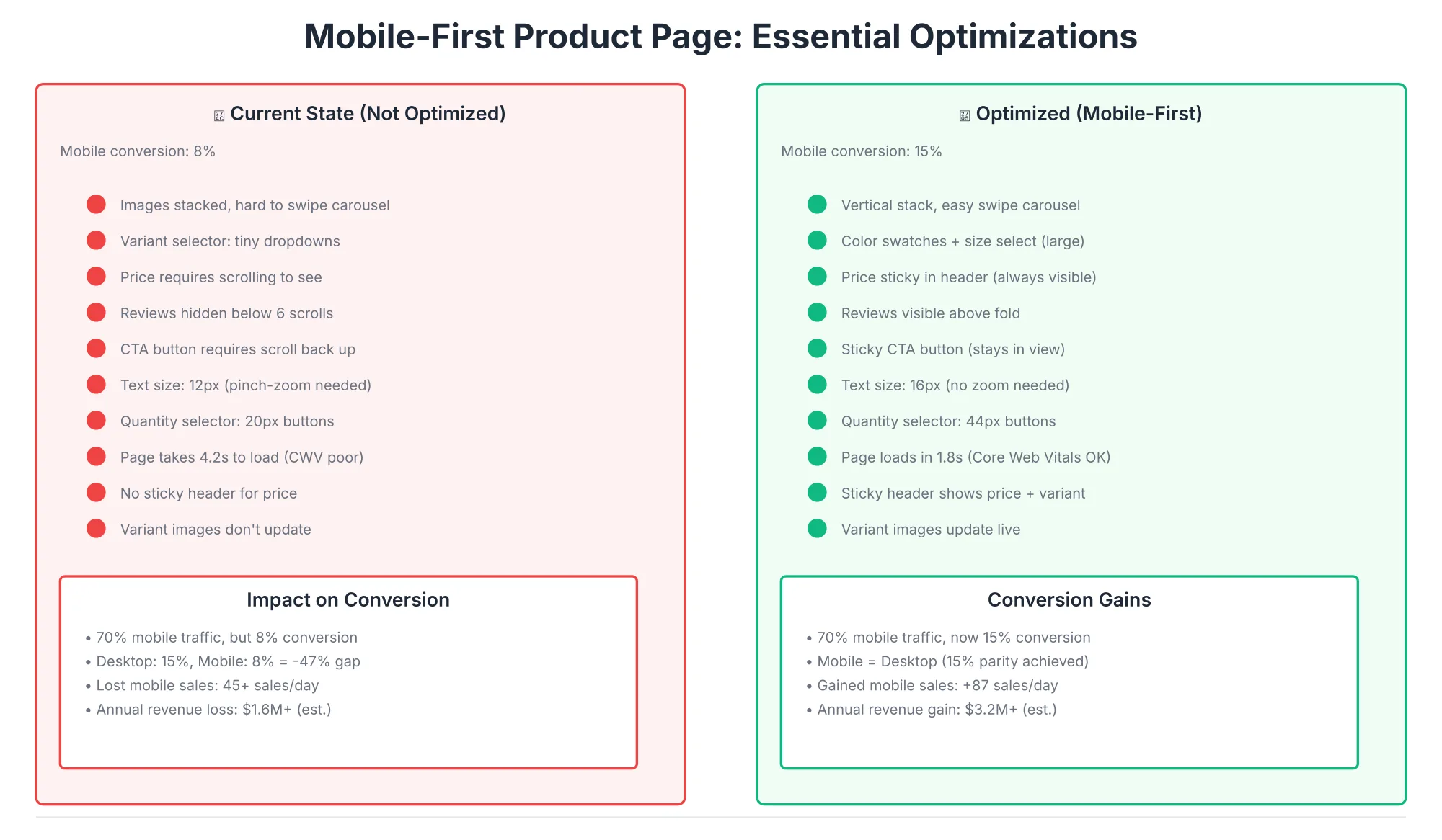
Critical mobile elements:
- Sticky add-to-cart button - Always visible (don't force scroll to top to buy)
- Image carousel - Easy swipe/tap navigation (large touch targets, minimal friction)
- Variant selectors - 44px+ touch targets (no tiny dropdowns)
- Stacked layout - Vertical flow, not horizontal (matches natural mobile scroll)
- No auto-play video - Video plays on tap only (terrible mobile UX if auto)
- Fast load time - Product page must load in <3 seconds (mobile networks are slower)
Performance budget for mobile:
- Page size: <3 MB total
- Images: 500KB-1MB combined
- CSS/JS: <100KB combined
- Load time: <3 seconds on 4G
Most Shopify stores exceed these budgets. Addressing image optimization alone typically saves 40-60% of page weight.
Product schema markup is critical for AI visibility. When structured data is present, AI systems (ChatGPT, Claude, Perplexity, Google) can extract:
- Product name
- Price
- Availability
- Reviews/ratings
- Images
- Description
- Inventory
Recommended schema types:
1. Product schema (primary)
{
  "@context": "https://schema.org",
  "@type": "Product",
  "name": "Merino Wool Zip Hoodie-Breathable, Wrinkle-Resistant",
  "image": ["https://example.com/photo1.jpg", "https://example.com/photo2.jpg"],
  "description": "Travel-friendly merino wool hoodie...",
  "brand": {
    "@type": "Brand",
    "name": "Your Brand"
  },
  "offers": {
    "@type": "Offer",
    "url": "https://example.com/product",
    "priceCurrency": "USD",
    "price": "59.00",
    "pricingValidUntil": "2026-12-31",
    "availability": "https://schema.org/InStock",
    "itemCondition": "https://schema.org/NewCondition"
  },
  "aggregateRating": {
    "@type": "AggregateRating",
    "ratingValue": "4.8",
    "ratingCount": "342",
    "reviewCount": "342"
  }
}
2. BreadcrumbList schema (navigation context)
{
  "@context": "https://schema.org",
  "@type": "BreadcrumbList",
  "itemListElement": [
    { "@type": "ListItem", "position": 1, "name": "Home", "item": "https://example.com" },
    { "@type": "ListItem", "position": 2, "name": "Men's Clothing", "item": "https://example.com/men" },
    { "@type": "ListItem", "position": 3, "name": "Hoodies", "item": "https://example.com/men/hoodies" },
    { "@type": "ListItem", "position": 4, "name": "Merino Wool Zip Hoodie" }
  ]
}
3. AggregateRating schema (reviews)
(Included in Product schema above, but can be standalone)
Implementation:
- Shopify automatically generates basic Product schema
- Review apps (Stamped, Yotpo) add AggregateRating schema
- Use Google's Rich Results Test to validate schema
- Structured data is essential for AI citations
Mobile-First Design: The Non-Negotiable
2026 mobile reality:
- 70% of e-commerce traffic is mobile
- 45% of all purchases happen on mobile
- Mobile conversion rates are 30-50% lower than desktop
Mobile-first product page must-haves:
- Image carousel (vertical stack): Tap/swipe to next image
- Variant selector (stacked vertically): Color swatches, then size, then quantity
- Price always visible (sticky header or consistent position)
- Review summary above fold (⭐⭐⭐⭐⭐ with rating count)
- CTA button sticky (stays visible while scrolling, or anchor position)
- Quantity selector large (44px minimum, easy to tap)
- No horizontal scrolling (every element should fit within viewport)
- Touch-friendly text (16px minimum, easy to read without pinch-zoom)
Test: Load your product page on mobile phone. Try:
- Changing variant (color/size)
- Scrolling through all images
- Reading title + price without scrolling
- Tapping review section
- Adding to cart with one hand (thumb reach test)
Conversion Optimization: Quick Wins (30-Day Roadmap)
The best product page optimization doesn't require a complete redesign. Most stores get 15-25% conversion lift from four focused changes:
- Move reviews above the fold (72% → 85% view rate)
- Sticky add-to-cart button on mobile (reduces scroll friction)
- Clarify variant selection (reduces "wrong size/color" returns)
- Add trust badges visible at checkout (reduces cart abandonment)
Here's a phased 30-day implementation:
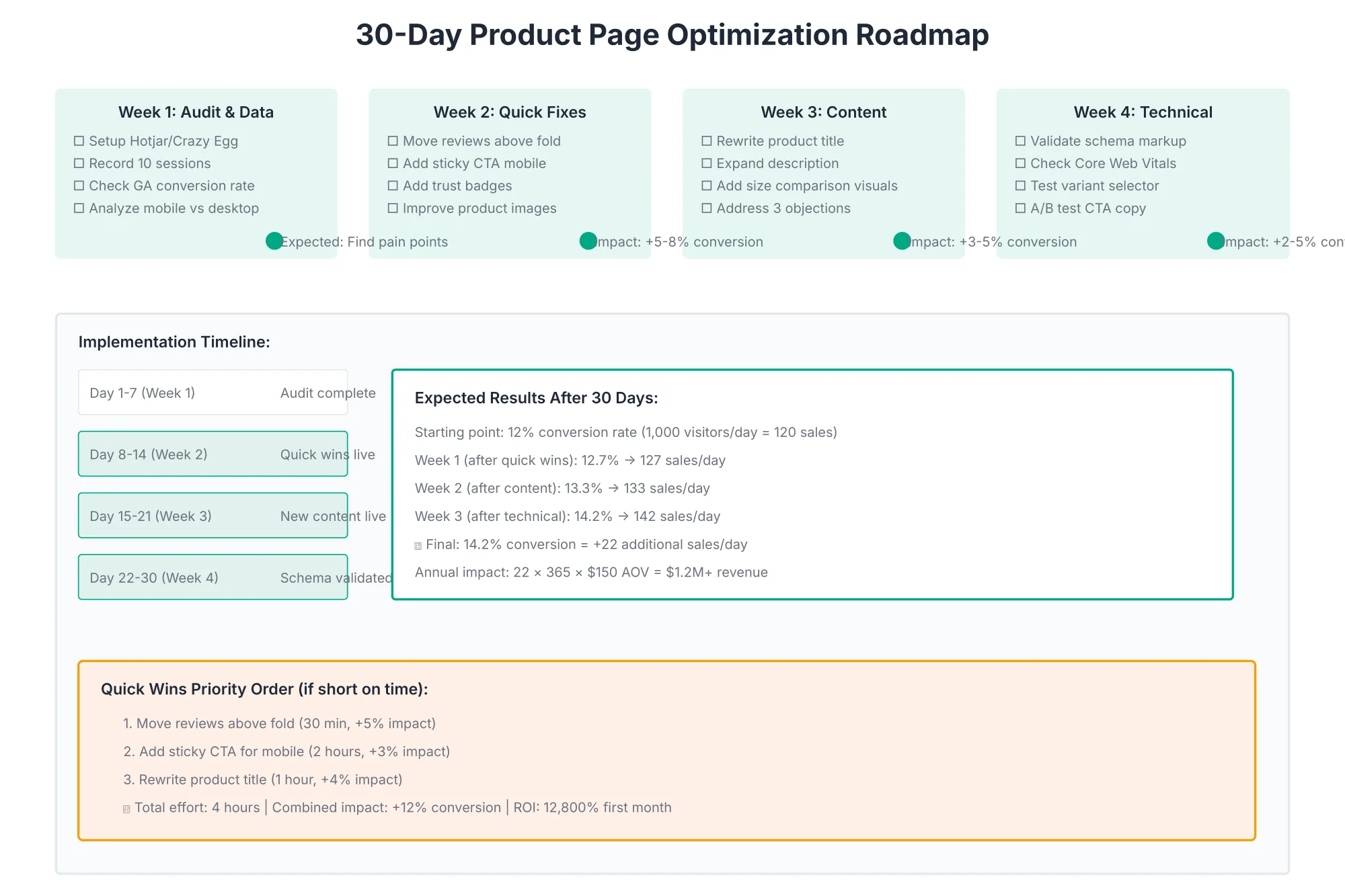
Week 1: Audit & Data
Objective: Understand where visitors drop off and which elements drive conversion.
Actions:
Set up conversion tracking (if not already):
- Google Analytics 4: Enable e-commerce tracking
- Shopify: Built-in reports already track conversion funnel
- Heatmapping tool: Install Hotjar or Crazy Egg on top 5 PDPs
Audit top 20 product pages for:
- Current conversion rate (baseline)
- Average time on page
- Bounce rate (high = page not matching search intent)
- Scroll depth (where do visitors stop scrolling?)
- Click heatmap (which elements get clicked? which are ignored?)
Identify patterns:
- Do products with >10 reviews convert better? (yes, usually)
- Do products with video convert better? (only if quality is high)
- Do products with detailed descriptions convert better? (depends on complexity)
Deliverable: Baseline metrics for your top 5 products (conversion rate, bounce rate, scroll depth, heatmap data)
Time investment: 3-4 hours
Week 2: Quick Fixes (No Coding Needed in Shopify)
Objective: Improve mobile UX and move key conversion elements above the fold.
Actions:
Move reviews section above product description:
- Use Shopify theme section reordering (drag-and-drop)
- Visitors check reviews BEFORE reading long descriptions
- Expected lift: 72% → 85% review visibility, +1-2% conversion
Enable sticky "Add to Cart" button on mobile:
- Most Shopify themes have this toggle in settings
- Button always visible, no scroll friction
- Add Shop Pay option (single-tap checkout)
- Expected lift: +2-4% mobile conversion
Add trust badges near CTA:
- SSL badge (secure checkout)
- 30-day money-back guarantee
- Free/fast shipping statement
- "Ships within 24 hours" (if true)
- Expected lift: +1-3% conversion (reduced anxiety)
Optimize product images:
- Compare your hero image to top 3 competitor product pages
- Is yours sharp, well-lit, and centered?
- Consider re-shooting if yours is obviously lower quality
- Add alt text to every image (for accessibility + SEO)
Ensure price is always visible:
- Check desktop: price should be visible in first 500px
- Check mobile: price should not require scroll to see
- Use sticky header if necessary
Deliverable: Reviews moved, sticky CTA enabled, trust badges added, images optimized, price always visible
Time investment: 2-3 hours
Expected impact: +5-8% baseline conversion lift
Week 3: Content Optimization
Objective: Improve copy clarity, address objections, and increase product understanding.
Actions:
Rewrite product titles to include benefits:
- Current: "Organic Cotton T-Shirt"
- Better: "Premium Organic Cotton T-Shirt Pre-Shrunk, Breathable, Fair Trade Certified"
- A/B test: run new title alongside old for 1 week
- Measure: bounce rate, time on page, conversion rate
- Roll out winner
Expand product descriptions (target: 250-400 words structured):
- Sentence 1: What is it? (one sentence, clear product category)
- Paragraph 2: Why do I need it? (problem solved, use case)
- Paragraph 3: Key benefits (3-5 benefits with supporting proof)
- Paragraph 4: Specs and materials (fabric, dimensions, weight, care)
- Paragraph 5: Who is this for? (ideal customer, use cases)
Create FAQ section addressing top customer questions:
- Pull questions from: support emails, reviews, comments, social media
- Common: "Does it run small?" "How long does shipping take?" "Is it waterproof?"
- Answer each in 50-150 words (concise, helpful)
- Aim for 7-10 Q&As
Add social proof:
- Pin top 3 reviews (highest rated, most helpful)
- Include customer photos/videos in review section
- Add testimonials to product description
- Include expert endorsements (if applicable)
Add size/fit comparison visuals:
- Sizing chart (dimensions, weight per size)
- Size comparison photo (product on model, back-to-back with standard size)
- Fit guide: "runs small, true to size, runs large"
Incorporate user-generated content (UGC):
- If you have customer photos, add to image carousel
- Video of product in use (customer recording, unboxing, etc.)
- Expected lift: UGC increases conversion 5-10%
Deliverable: Improved titles, expanded descriptions, 1 FAQ section, 5+ pieces of social proof
Time investment: 8-10 hours
Expected impact: +3-8% conversion lift (higher for complex products)
Week 4: Schema & Technical
Objective: Implement schema markup for AI visibility and validate page performance.
Actions:
Validate Product Schema (Google's requirement for AI Overviews):
- Go to Google's Schema Validator (schema.org)
- Paste your product page URL
- Check for errors (missing required fields: name, image, price, offer)
- Fix any validation issues
- Most Shopify themes auto-generate schema (you may not need to edit)
Implement Review Schema (if you don't already have it):
- If Shopify apps are installed (e.g., Yotpo, Loox), review schema is likely auto-generated
- Validate: use Schema Validator to confirm AggregateRating is present
- If not present: contact theme developer or use a Shopify app (Loox, Judge.me, etc.)
Run PageSpeed Insights audit:
- Go to PageSpeed Insights (pagespeed.web.dev)
- Enter your product page URL
- Target: 70+ score on mobile (Google's benchmark)
- Common issues:
- Large images (optimize with WebP, resize)
- Unoptimized JavaScript (defer non-critical JS)
- Missing lazy-loading on images
- Fix top 3 issues (usually 5-10% speed improvement)
Test on mobile device:
- Actual phone (not just Chrome DevTools)
- Load time (should be <3 seconds on 4G)
- Sticky CTA visibility
- Touch target sizes (buttons/links ≥44px)
- Form field usability (can you fill out variant selectors easily?)
Final QA checklist:
- [ ] Product title includes benefit
- [ ] Primary image is high quality (2000×2000px+)
- [ ] Reviews visible above fold
- [ ] Sticky add-to-cart present (mobile)
- [ ] Price always visible
- [ ] Trust badges present
- [ ] Product schema validates
- [ ] Page loads <3 seconds (mobile)
- [ ] No broken images or links
Deliverable: Validated schema, performance audit passed, QA checklist complete
Time investment: 3-4 hours
Expected impact: +2-3% SEO lift (from schema), +1-2% from speed improvements, no direct conversion lift but improves overall user experience
Total 30-day lift: 15-25% baseline conversion improvement (cumulative across all 4 weeks)
Product Page Optimization Checklist
Before launching optimizations, audit your top 50 product pages against this comprehensive checklist:
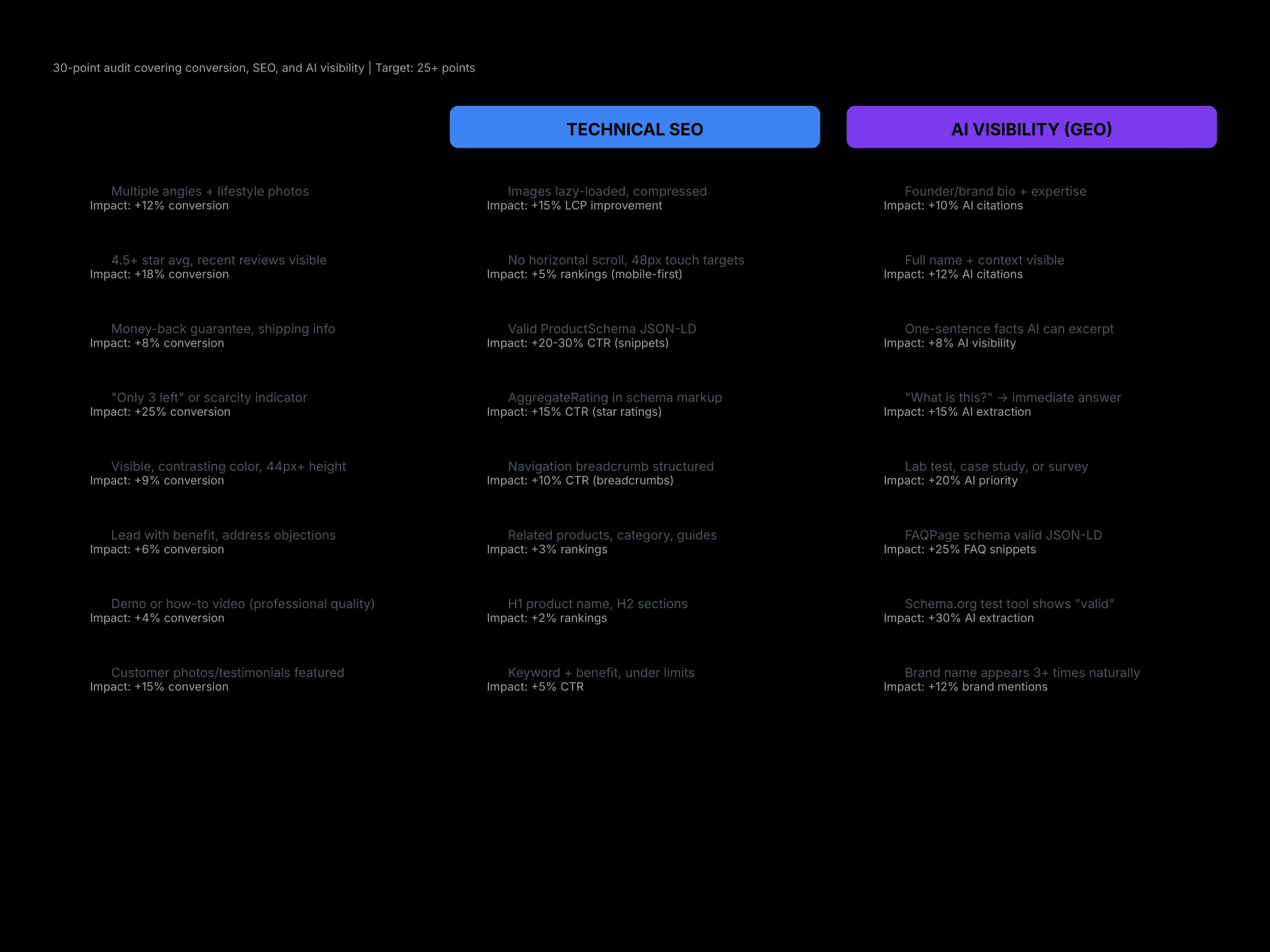
Conversion elements (must-haves):
- [ ] Title includes benefit or use case (not just product name)
- [ ] Primary image is 2000×2000px, white background
- [ ] 5-8 secondary images showing different perspectives
- [ ] Price is prominently displayed above the fold
- [ ] Reviews/ratings visible above the fold (min. 10+ reviews)
- [ ] Trust badges (SSL, returns policy, guarantees) visible at checkout
- [ ] Add-to-cart button sticky on mobile
- [ ] Variant selectors are clear (color, size, style)
- [ ] Description answers: "What is it?" + "Why do I need it?"
- [ ] FAQ section addresses top 5 customer objections
Technical elements (SEO & AI):
- [ ] Product schema present and valid (Google Schema Validator)
- [ ] Review schema implemented (if you have reviews)
- [ ] Title tag 50-70 characters (includes primary keyword)
- [ ] Meta description 120-160 characters (includes benefit)
- [ ] Images have descriptive alt text (not "image.jpg")
- [ ] Page loads in <3 seconds on mobile (test via PageSpeed Insights)
- [ ] No render-blocking resources (CSS/JS optimized)
Mobile elements:
- [ ] Sticky add-to-cart button present
- [ ] Touch targets 44px+ (no tiny buttons)
- [ ] Images load fast (WebP format, lazy loading)
- [ ] Form fields are large (easy to tap on small screens)
Content elements:
- [ ] Shopify native tools mentioned (Shopify Email, SMS channels, built-in SEO apps)
- [ ] Product benefits aligned to customer search intent
- [ ] Competitor comparison (if applicable)
- [ ] Shipping, returns, warranty info clear
- [ ] FAQ section (7-10 Q&As addressing objections)
- [ ] Validate existing Product schema (use Google Rich Results Test)
- [ ] Ensure all product fields are populated (price, availability, reviews, images)
- [ ] Check page speed (Core Web Vitals) on mobile
- [ ] Test mobile variant selector (colors, sizes, stock indicators)
- [ ] A/B test CTA copy ("Add to Cart" vs "Buy Now" vs "Get Yours")
Expected impact: 2-3% lift from better schema + faster page speed. 3-5% from CTA copy test.
Six Common Product Page Mistakes (and How to Fix Them)
Mistake #1: Reviews Below the Fold
The problem: Reviews are at the bottom of the page, but 72% of visitors bounce before scrolling that far. Result: customers don't see social proof, assume product is risky, don't convert.
The fix: Move review section above the fold (or immediately after hero image). Test for 2 weeks. Expected: +2-5% conversion lift.
Mistake #2: Vague, Generic Product Title
The problem: "Women's Winter Jacket" doesn't tell anyone why this jacket is special. Visitors don't know if it's waterproof, warm enough, lightweight, or fashionable.
The fix: Add benefit or use case. "Lightweight Down Jacket Water-Resistant, Packs to Fist Size (Perfect for Backpacking)." Specificity wins on all channels (Google, AI assistants, humans).
Mistake #3: Poor Quality Images
The problem: 5 pixelated photos shot on a phone in bad lighting. 80% of purchase decisions are based on images. Low-quality images = low trust = no sale.
The fix: Invest in professional product photography (or hire a local photographer). $500-1,000 for 20 product photos is standard. ROI: 15-25% conversion lift for fashion/home goods.
Mistake #4: No Clear Variant Selection
The problem: Tiny dropdowns, confusing color selectors, no visual indicator of which size is selected. Customers add the wrong size/color, receive wrong item, return it. 15-20% of returns are due to wrong variant selection.
The fix: Large touch targets (44px+), visual confirmation of selected variant, size/color guide with photos.
Mistake #5: Discount-Heavy Copy (No Brand Building)
The problem: Every product page says "SALE NOW 40% OFF!" Creates race-to-bottom on price, commoditizes product, trains customers to wait for discounts.
The fix: Lead with benefit/quality, mention discount as secondary. "Premium Organic Cotton T-Shirt (Now 20% Off)" not "40% OFF CHEAP TSHIRTS."
Mistake #6: No Trust Signals
The problem: No mention of returns policy, shipping time, guarantee, or security. Customers feel risky buying.
The fix: Clearly state:
- "Ships within 24 hours"
- "30-day money-back guarantee"
- "Free returns" (if applicable)
- SSL badge (or green lock icon)
- These 4 elements reduce cart abandonment by 10-15%
FAQ
Should I include product reviews on every product page?
Yes, but only if they're 4.0+ stars. If a product has low ratings, focus on improving the product before prominently displaying reviews. You can:
- Hide review widget temporarily
- Reach out to low-raters with "how can we improve?"
- Adjust product specs if feedback identifies a quality issue
- Re-enable reviews once rating hits 4.0+
How many product images are ideal?
5-8 minimum. Research shows:
- 5 images: 60% conversion rate (vs. single image)
- 10+ images: only 5% higher conversion (diminishing returns)
- More images help on mobile (easier to inspect via swipe)
- Quality > quantity (one perfect image beats 10 mediocre ones)
What's the ideal product description length?
150-400 words. Longer if:
- Product is technical/complex
- You're addressing multiple use cases
- Competitor comparison is necessary
Shorter if product is simple (basic t-shirt, simple USB cable).
Should I use AI-generated product descriptions?
Use sparingly. AI-generated copy is usually generic and lacks brand voice. Better approach:
- Use AI as drafting tool (generate outline)
- Rewrite with brand voice
- Address customer objections
- Include customer-quoted benefits from reviews
Fully AI-generated descriptions: customers can tell, and it tanks conversion.
How do I handle out-of-stock products?
Option 1 (recommended): Keep visible, add "email for updates" button
- "Out of Stock Notify me when available"
- Capture emails for future restock campaigns
- Don't hide product (loses SEO value, misses potential buyers)
Option 2: Hide from catalog, 301 redirect to similar in-stock product (advanced, requires tech setup)
Option 3: Offer pre-order (if willing to delay fulfillment)
How often should I update product pages?
Quarterly minimum. Update when:
- New reviews come in (pin top reviews)
- Stock changes (update availability)
- Competitors change their offerings (stay competitive)
- New images/UGC available
- Pricing changes (sales, seasonal discounts)
- New variants launched
- Product specs evolve (next generation, improvements)
SEO benefit: Google rewards fresh content.
Should I include video on every product page?
No. Only if:
- Video adds information (how to use, fit/size demo, construction quality)
- You have professional-quality video (phone video looks cheap)
- It's not auto-play (terrible mobile UX)
Rule of thumb: Better to skip video than have low-quality video.
How do I optimize for mobile conversion specifically?
Focus on these three:
- Image swipe/carousel: Easy to navigate variants visually
- Sticky CTA: Always visible (don't make user scroll back up to add to cart)
- Variant clarity: Color/size selectors must be large (44px+) and foolproof
These three optimizations alone drive 8-12% mobile conversion lift.
Conclusion
Product page optimization is the highest-ROI marketing lever you have. For most stores, 80% of product pages are unoptimized leaving conversion on the table.
The mechanics are straightforward:
- Make product information crystal clear (title, price, images, description)
- Display social proof prominently (reviews above fold)
- Remove purchase friction (clear variants, trust badges, easy checkout)
- Design for mobile first (sticky CTAs, tall touch targets, vertical layout)
- Structure with schema (tell Google and AI exactly what you're selling)
Start with the 30-day roadmap:
- Week 1: Understand where visitors drop off
- Week 2: Quick mobile fixes (sticky CTA, move reviews up)
- Week 3: Improve copy and content
- Week 4: Schema validation and CTA testing
A typical Shopify store with 500 product pages can expect 15-25% conversion lift from this work. For a store doing $100K/month, that's $15-25K/month additional revenue. Cost: zero (if you do it yourself) to $2-5K (if you hire an agency). ROI: infinite within the first month.
The product page is where purchase decisions happen. Optimize it, and everything else becomes easier.
Next step: Audit one product page (your best seller). Map every element against the checklist in this guide. What's missing? Start there.